Easy Home Updates You Can Do In A Flash
Welcome to part two of a mini home makeover I helped with for a friend. I will be focusing more on the kitchen and breakfast nook today. Check out the first part here. There are so many little ideas you cans steal to make impactful changes to your own décor without spending a ton of money. Here is how the kitchen started…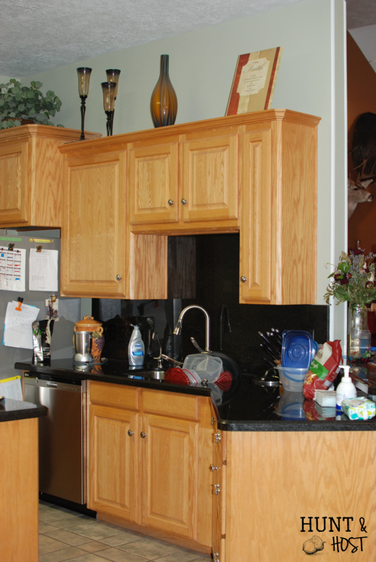
This kitchen has great space and the breakfast table looks out onto acres upon acres of pasture and forest. It is breathtaking. I would love to have that view each morning! The kitchen just needed a little love to bring it up to date and make it a tad bit more functional for this family of five. Our friend wanted a Tuscan theme and we actually went off inspiration from a platter she had displayed in her kitchen. It was bright and vibrant with lemons that displayed a fresh and warm feel. This was our guiding force in transforming the kitchen area. When you don’t know where to start when decorating a space, I always think an inspiration piece is a great place to begin.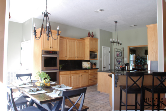
We started off by removing the décor above the kitchen cabinets. Shellie (the homeowner) has a beautiful collection of Italian glass vases. The problem was they were getting lost in the mix. We wanted to show them off! So we pulled them (and the old greenery) down from the high up dusty shelves that just get overlooked. We moved most of the glass to the living room…you can check it out in the part one post. Instantly the room felt bigger, brighter and fresh. New cabinet hardware was installed to help tie the new and the old together.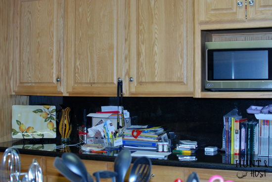
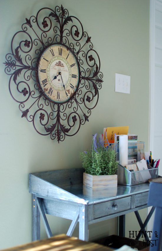
The next point to ponder in the functionality department was a place just for Shellie. She was using the kitchen counter to house all her paperwork and to-do items. She NEEDED a space for her. A mom’s desk. I’m a firm believer you have to have a spot, no matter how small, carved out just for lady of the house business. We have a lot to do and need a space to do it! We came up with a small table just for Shellie – a place to contain all her important papers and tasks. It is beautiful and highly functional. It also clears up that valuable real estate we call counter space. Look around your house, maybe it’s a closet or dresser, but find a spot for you if you don’t already have one! It doesn’t have to be big, just yours.
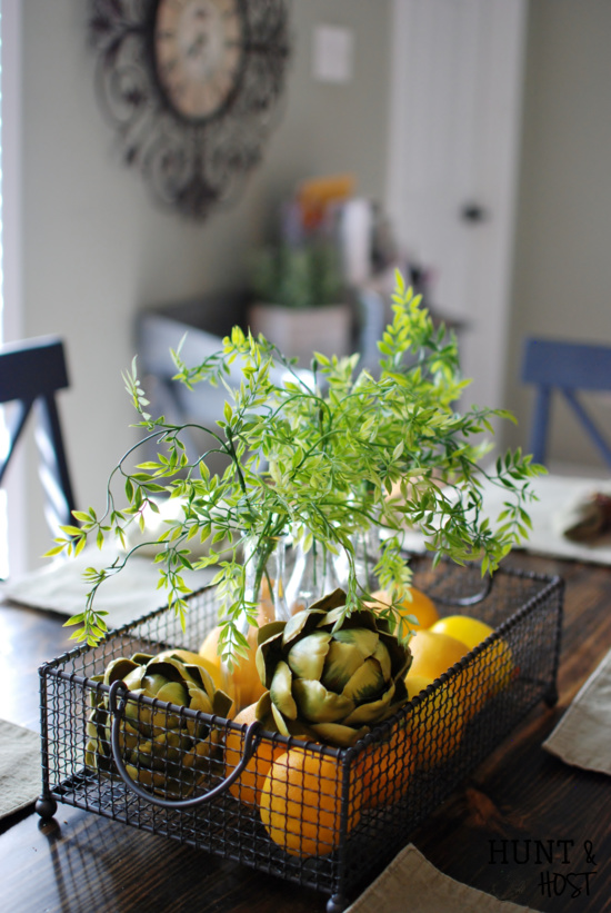
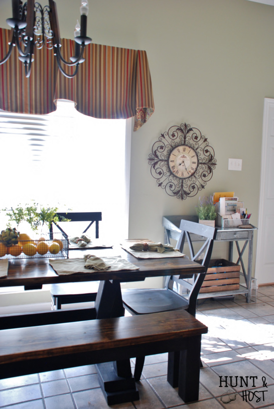
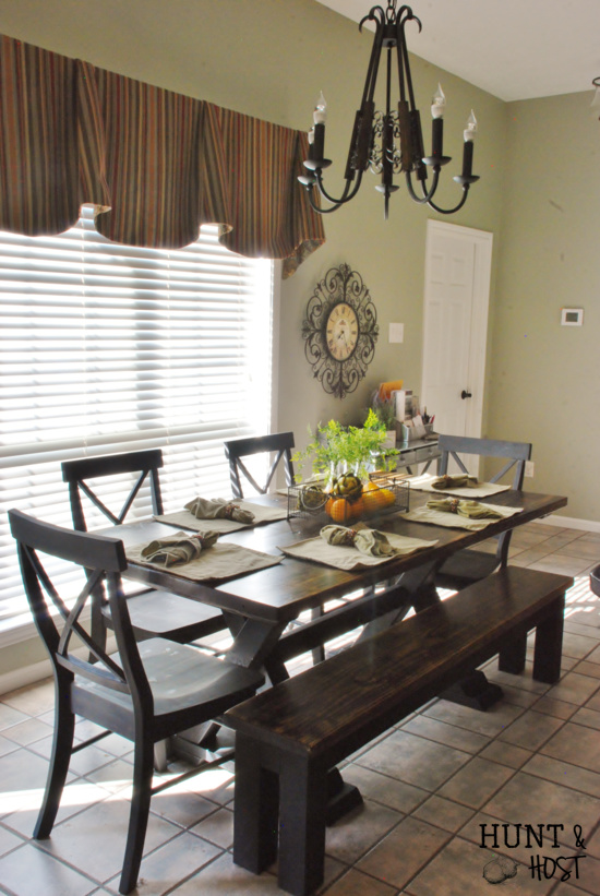
Next up was the breakfast nook. We really wanted to draw out that window and it was time for some lighting updates. The lights evoke our Tuscan theme. Lighting adds major impact if you are looking to update your space. You NEED to consider lighting a must on your update check list. We pulled together the wall color, living room colors and Tuscan feel for the fabric choice in the curtains. Something simple but bold. Thanks Deedles for another sewing job well done! 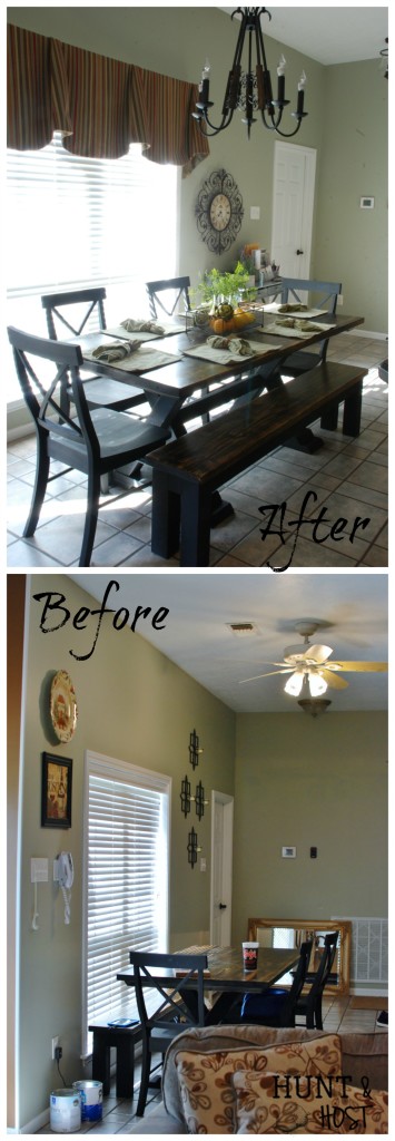 The curtains help anchor the large wall space, cozy it up with the soft texture fabric brings and tie all the aspects together. Lowering the wall hangings also helps draw the space in. The room needed some pops of fresh bright color and we brought that in through minimal use of new greenery, fruit and veggies.
I was part of a team that changed this space and every time I work on a project like this we learn. And we learn and we learn. Then we learn some more. It’s an amazing process that Proverbs 27:17 speaks to. As iron sharpens iron, so one person sharpens another. It’s not just decorating we learn about, but we do gain knowledge there. We learn about each other, the power of prayer, humble servant hearts and so much more. We have lots of sharpening left to go, but these experiences get us heading in the right direction. We are so pleased with the way this space turned out. What makes our hearts the most joyful is knowing that our friend Shellie loves and feels loved by her new space. That is what it’s all about.

That window seriously doubled in size by adding the window treatment!
I know right!? Window treatments are the best and often so overlooked.
Wow. Crazy awesome!! I’m agreeing with Shelly- I can’t believe how much that window treatment did for that space.
Fabric softens and adds a great texture. I love a window treatment!
So fabulous! As always you ladies did an amazing job!!! Congrats to Shellie on her new rooms 🙂
thanks Katie! it was a great project
I like how you pulled in/eliminated the smaller artwork to create a more directed focal point. Great work ladies!! The accessories are really a Tuscany style update too. Blessings
thank you, it was a fun makeover!